Screeenshots of Netpy's graphical user interface
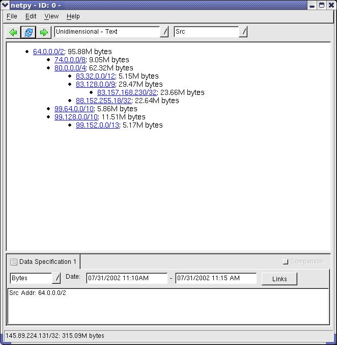
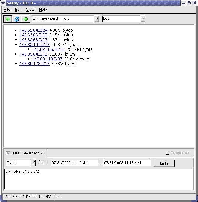
All these screenshots are based on actual NetFlow flow records, but we anonymized all the IP addresses.
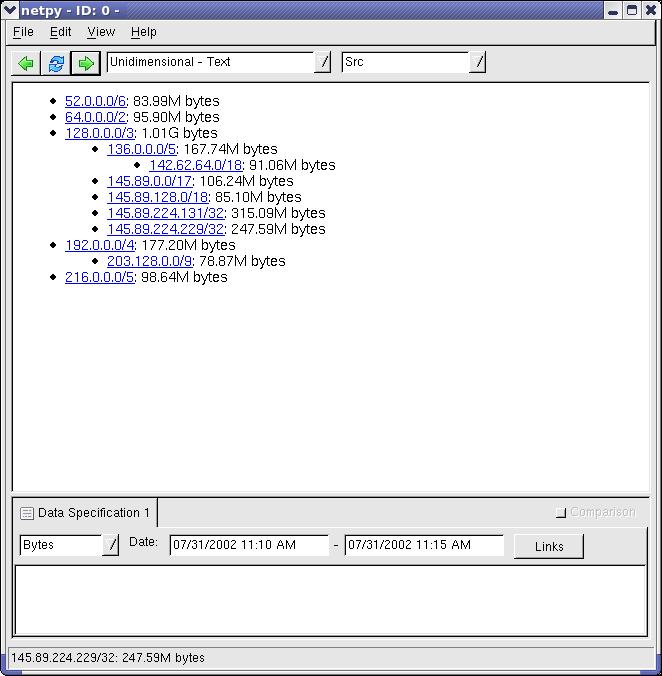
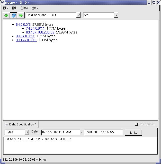
A hierarchical heavy-hitter analysis of the traffic during a five minute interval.
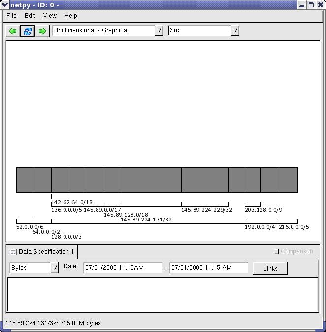
The same analysis graphically. The sizes of the segments are proportional to the traffic of the prefixes they represent, and when the user brings his mouse over one of the segments, the bottom left corner displays the actual amount of traffic for the corresponding prefix.
By clicking on one of the links in the textual report or on one of the segments, the can drill down and get an analysis of the selected prefix. (The user also has to push the blue refresh button.)
We can also get an analysis of the destinations that computers from 64.0.0.0/2 send to.
We can further drill down on both source and destination prefix.